A graphic design exercise focused on the relationship between form and idea through three stages, from representational to abstract.
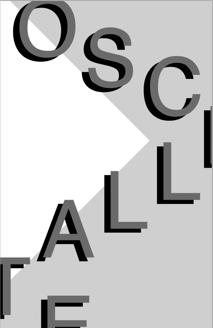
In my first attempt (above), I represented Oscillate in three ways. First, through the word "oscillating" across the page. Second, by the oscillation in gray tones. Third, by the compositional elements moving in a curve.
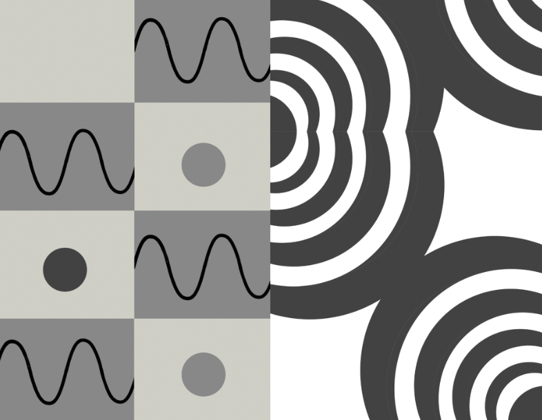
In my second attempts, I represented Oscillate without the word itself. I leaned a lot on representational elements, like sine waves and pendulum spheres. I also utilized the composition as a form of oscillation. In the feedback I received, people indicated that my compositions looked industrial, wire-like, and sonar-like. I began thinking more critically about the shape and how to dissolve representational elements.
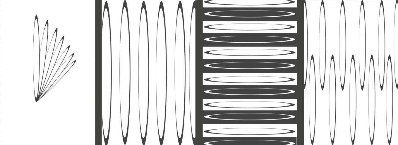
In my third attempts, I represented Oscillate without the word itself or any representations.
I enjoyed this step the most, as I played with the feeling of optical illusions to generate the feeling of oscillating. After this iteration, I began thinking more critically about the formal elements of each shape I was putting on the page: its width, height, depth, and thickness. The number of shapes on a page and how it interacts with edges. The sizing and color of each shape.
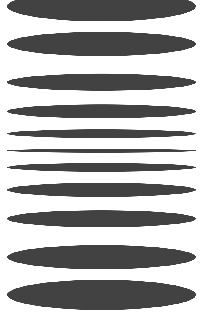
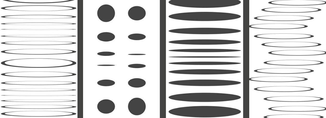
This is my final iteration of Oscillate. I boiled down the elements, focusing on shape, width, and depth. Although I am not satisfied, I believe I achieved some feeling of optical illusion and oscillation. If I were to continue improving, I would re-consider the composition of the shapes on the page and represent the shape oscillating multiple times, rather than once.